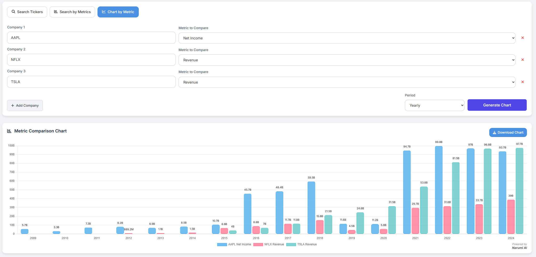
Chart by Metric
Go beyond single-company analysis and create custom, multi-metric comparison charts. This powerful tool allows you to visualize the relationship between different financial metrics across multiple companies, all on a single, unified timeline.
How It Works
From the main Dashboard, select the "Chart by Metric" mode. This will open an interactive form where you can build your custom chart:
- Add Companies: Start with one or two rows. Click the "+ Add Company" button to add up to five rows to your comparison.
- Select Ticker: In each row, enter the ticker symbol for the company you want to analyze.
- Select Metric: For each company, choose the specific financial metric you want to plot from the dropdown menu. This is where the power lies—you are not limited to comparing the same metric.
- Generate Chart: Once you've configured your comparison, click "Generate Chart" to instantly see your custom visualization.
Use Case Examples
This feature unlocks deeper analytical possibilities. For instance, you can:
- Compare Revenue vs. Profitability: Plot Apple's Revenue on the same chart as Microsoft's Net Income to see how each company's top-line growth compares to the other's bottom-line profit.
- Analyze Cash Flow vs. Debt: Chart Amazon's Free Cash Flow against its Long Term Debt to visualize how its cash generation capabilities are managing its liabilities over time.
- Industry Peer Analysis: Compare the Gross Profit of NVIDIA, AMD, and Intel on a single chart to quickly identify the leader in operational efficiency within the semiconductor industry.