Interactive Charting
Instantly visualize any financial metric to uncover trends and performance over time. Our charting tool is designed to be powerful yet simple to use.
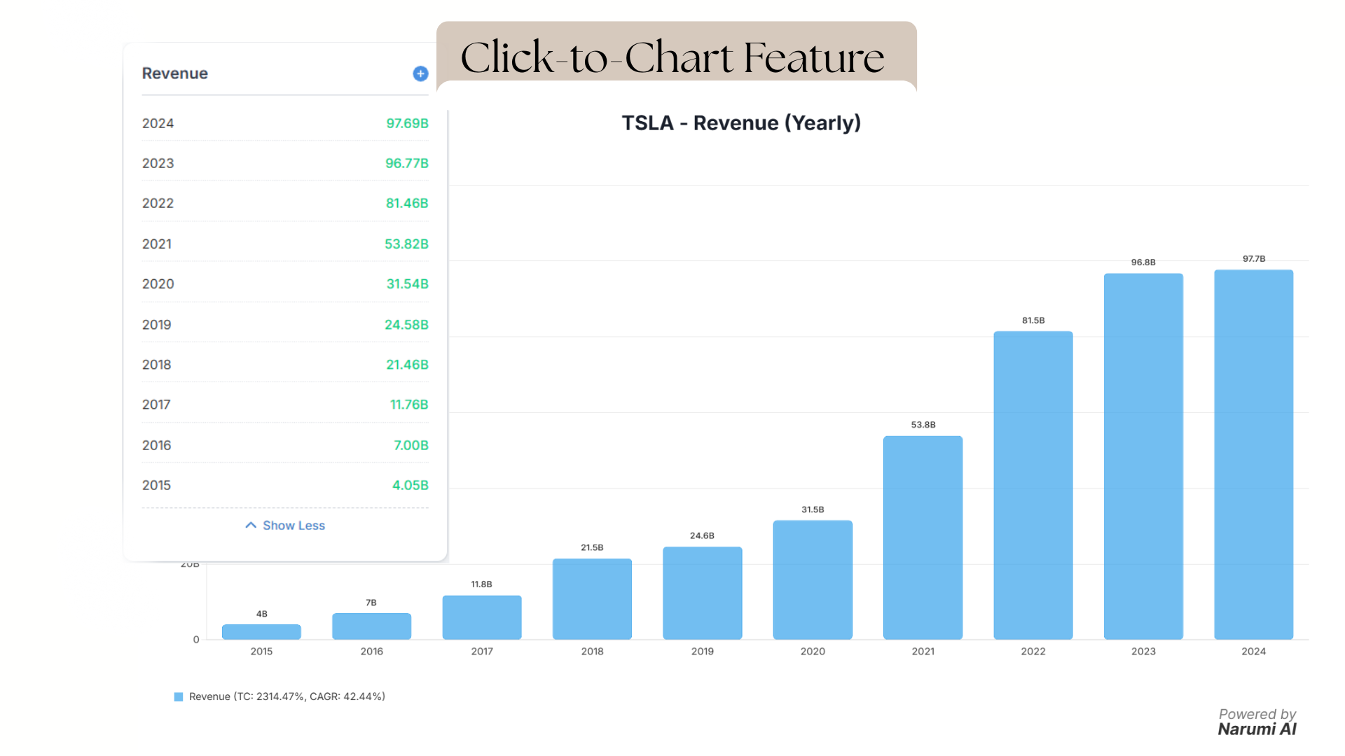
How It Works
From any company's Analysis Page, simply click on the title of any metric card (e.g., "Revenue", "Net Income"). A chart will instantly appear at the top of the page, displaying the historical data for that metric.
Key Capabilities
- Multi-Metric Analysis: You can add up to eight different metrics to a single chart. This is perfect for comparing related data, such as plotting Revenue against Net Income to see how sales growth translates to profitability.
- Data Views: Easily switch between "Yearly" and "Quarterly" data views to adjust the time frame of your analysis.
- High-Quality Downloads: Every chart can be downloaded as a crisp, high-quality PNG image, ready for your reports, presentations, or personal records.